04/2021 visual culture
Libération is an iconic newspaper launched in 1973 by a group inspired by the revolutionary spirit of Paris in 1968. The vision of its founders, which included Jean-Paul Sartre, was of a newspaper owned by its workers and committed to journalistic integrity. Taking its name from a 1941 French Resistance newspaper with ties to the Communist Party, which closed in 1964, the new daily maintained independence from any party while espousing its leftist, socially progressive position.
For the first eight years, the paper did not sell any advertising space, making its money solely from newsstand and subscription sales, and the entire staff received the same salary. This created an in-built financial fragility that, when later combined with the digital disruption of journalism as a whole, nearly caused the paper to close in 2014.
But, for now, the story lives on. “News is a battle,” read a 2009 ad campaign for the paper, reflecting its innovative and provocative tactics. According to editor Laurent Joffrin, a veteran of the early days, “Libération is, above all, a way of living audaciously.” This attitude has helped the paper build a small yet devoted core of readers, but its survival over three decades has been possible thanks to a team of journalists who defended editorial control against external interests, even though doing otherwise would provide financial oxygen: their commitment to integrity has always come before profitability.

A special edition in which photography is replaced with illustration throughout the entire issue on the occasion of the Angoulême International Comics Festival. (Image: Libération, Newspaper Design)
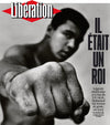
It is a newspaper known for promoting social causes such as sexual freedom, the equality of women, and secularism and for defending the French public sector. Also, of all the world’s newspapers, Libération is possibly the one that gives the greatest amount of coverage to culture and lifestyle trends: at least 20% of the lead stories on the front page are cultural, and its criticism of music, film, and books is among the most respected in Europe. Long before other daily papers in its market, Libé, as it is affectionately called, experimented with typography, prolific use of illustrations and comics, and putting photography at the same level of importance as text.
“It is a form of writing,” states Christian Caujolle, an early photographic editor at i who later, with the paper’s cooperation, launched VU, a prestigious photo agency. However, the paper has never had staff photographers, relying instead on a dynamic team of photo editors who enjoy a high degree of control in the newsroom, with an incomparable range of external talent on-call: Henri Cartier-Bresson, William Klein, Sebastião Salgado, and many other leading photographers have been contributors. Photographers around the world dream of being published in Libé, often accepting less than their usual rates for the privilege.
Because there were no hierarchies, all decisions were made as a group—a situation that became unsustainable. From February to May 1981, Libé disappeared for a few months while Serge July, its legendary editor and one of the founders, tried desperately to save it. The plan is known as “Libé 2,” which was unveiled later that year, signified the end of the paper’s foundational phase and introduced a certain degree of normalization as a business. Little by little, the first advertisements began to appear and capital was raised from investors unconnected to the newsroom (where the staff still held majority shareholder control).
From a graphic perspective, “Libé 2” featured a design project that would come to be the most recognizable in the newspaper’s 45-year history. It included, above all, the debut of the diamond-shaped logo, which remains the visual signature to this day. It was designed by Claude Maggiori, a member of the original 1973 team, who later became the paper’s art director.

Front pages featuring forceful and decisive typography are a historical characteristic of Libération. In May 2017, a giant “Non” over a photograph of Marine Le Pen makes clear the newspaper’s opposition to her National Front party ahead of the French presidential elections. (Image, Libération, Newspaper Design)
The period from 1981 to 1990, while not without challenges, was possibly the time of the newspaper’s greatest growth. Daily circulation in the 1980s reached roughly 300,000 copies. This improved position inspired July and his team to implement major changes. This project, dubbed “Libé 3,” was rolled out in 1994 and included a new printing press, new bylines, a new editorial, and graphic presentation, new sections, new teams—in all, a multimillion franc investment. It failed spectacularly. The following year, for the first time, the workers of the paper lost their controlling position in the newspaper.
From then on, Libération has struggled to survive, not only undergoing drastic personnel cutbacks but also swallowing various bitter pills in the form of businessmen, ideologically removed from the ethos of the paper, taking over the paper’s ownership. First, in 2005, business magnate Édouard de Rothschild, a person close to Nicolas Sarkozy, became a major shareholder. One year later, he brought about the traumatic departure of July, editor since 1974. In 2013, Bruno Ledoux entered the picture: a shadowy real estate investor, he brought with him outlandish plans that nearly caused the newspaper to close the following year.
Ledoux informed the staff of his plans to completely restructure Libé and expand its presence to include a social network and cultural space. He also announced that the headquarters of the paper would become a meeting point for young people with a bar and restaurant designed by Philippe Starck, while the newspaper operations would be moved to some other spot in Paris. At that point, the journalists rose and used the pages of the newspaper to publicly protest against the ownership: “We are a newspaper,” screamed one front page. This immediately generated a wave of sympathy and solidarity with Libération across France that managed to stymie Ledoux’s plans, at least partially.
In 2016, weakened and under strain, the paper left its historic headquarters. Today it shares offices with the weekly L’Express, an arrangement that can be seen as a metaphor for the arc of a once-defiant newspaper now forced to operate within limited possibilities. Despite the current condition of the paper, France—and what is more, visual journalism—would not be the same without the voice of Libération.
This story was originally featured in Newspaper Design. Explore the graphic designers, typographers, and editorial designers that helped make design as powerful as the headlines.


