How Leta Sobierajski and Wade Jeffree Tell Scented Tales
When it comes to fragrances, they have to please both the nose and eyes, in The Essence we profile a duo mastering this marriage
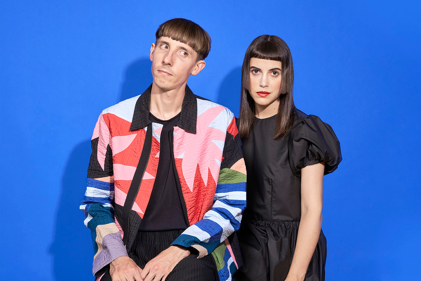
Creative duo Leta Sobierajski and Wade Jeffree challenge concepts of traditional fragrance visuals, freeing the medium from its outdated and stuffy style and replacing it with colorful, quirky, and highly unique imagery in line with the new era of scent that lies ahead.

D.S. & Durga were pioneers in the DIY Brooklyn movement around the turn of the century. They began by turning things they loved into scents. Here they teamed up the Brooklyn brand and lead the art direction, photography, and modeling.
Sobierajski and Jeffree are true originals. They have come up with an excitingly fresh take on perfume imagery: never repetitive, trademarked with a signature style of bright colors, crisp contrasts, and a wide range of textures. After setting up their shared design studio in 2016, they have built up a client base that includes Gucci, Comme des Garçons, D.s. & Durga, and the likes of Vogue and Google.
“There are so many inspirations involved in building a scent, and we love that we can utilize every element of the story to create our vision”
Whether it’s a hand wearing a black latex glove and holding the matte, gray bottle of the fragrance Concrete, or the Rose Atlantic perfume sitting in a fishbowl with pink pebbles and coral against a backdrop of magenta velvet curtains, each image perfectly encapsulates the spirit of a fragrance, often with a tongue-in-cheek twist. “We love the storytelling involved with a scent. While the smell itself is rich, the story needs to be just as articulate as the smell. We love being able to visualize the stories that scents aspire to tell, and we build worlds around the notes that inspire us,” they explain. “There are so many inspirations involved in building a scent, and we love that we can utilize every element of the story to create our vision.”

In honor of Gucci’s new fragrance, Bloom, Leta Sobierajski was invited to create her own visual interpretation of the scent. The result was a fairy-tale tabletop set filled with mysterious furry guests.
These stories include using the colors of Acqua Di Fiori’s packaging in the Leaning Tower of Pisa-style structure of colorful slabs and overflowing flora on top of which the perfume precariously sits, or placing a bottle of Freetrapper in a completely fur-lined setting as an ode to the men of the Jacksonian era who inspired the fragrance. The NYC-based creatives see factors such as lighting, color, and props as “additional vessels to bring the story more together. Color is associated with ingredients or landscapes, cultures, and history. Lighting helps depict the mood—is it a bouncy, light fragrance that exists along the seaside? Or is it dark, cryptic, and mysterious, shrouded in a hazy electric glow? We take all of these descriptive notes into consideration when building out our images.”
”It’s (fragrances) a gateway into the luxury landscape at a relatively affordable price and promotes this idea that you can own a snapshot of luxury”
One of their largest fragrance projects to date, which showcases this meticulous process, is the campaign imagery for D.s. & Durga’s 12 signature scents. “Creating an individual visual story for each fragrance is educational—we have to first research extensively to understand the references, the ingredients, and the locations that are noted. We love the time required to understand the Goddess Durga and her many weapons, or what people see when they watch the Marfa Lights in Texas,” they say.

From branding to photography, the married duo does almost everything together. They are known for embracing color and playful shapes in all formats. Another visual story from their D.S. & Durga campaign.
This adoration of the research aspect, and truly understanding a fragrance inside-out, may explain why the imagery stands out so much in an industry that too often resorts to overused depictions of romance, masculinity, femininity, sexuality, etc.

Based on D.S. & Durga's elaborate stories for each scent, we created individual vignettes that could embody the mood and story of each fragrance. This one is titled 'Cowboy Grass' from 2017, a herbal vetiver fragrance.
“Fragrance has weirdly been associated with celebrities, models, and sex. It’s a gateway into the luxury landscape at a relatively affordable price and promotes this idea that you can own a snapshot of luxury—it’s not that at all,” they state. “Fragrance is meant to help transport you, but it’s also an expression of identity, of personal interest. The notion of showing the ideal person who would wear a perfume is outdated—it’s for everyone, and it smells differently no matter who wears it.”


