How Visual Citizens Are Rendering The Future
Breaking architecture restriction through digital design
Visions of 'a future world' are being conceived daily in digital and virtual realities. They have the potential to change the way we work and think about spatial design. The art of designing is one of the most complex expressions of human imagination–it shows who we are, our history, and what direction we are heading toward. Digital realities are creations giving us an immersive glimpse of ways to design for our future surroundings. Visual Citizens are one of the design studios offering a window into the limitations of the future architectural world developing around us.
The idea for Visual Citizens first came together when Shali Moodley and Adam Kelly worked together at an architecture office in Barcelona.
Made up of Shali Moodley from South Africa and Adam Kelly from Scotland, their vision for a design studio first came together in Spain, where they worked together at an architecture office. The studio was later founded in Cape Town, early 2018, where they worked from briefly before relocating to Rotterdam, Holland. The pair relocated so they could learn Dutch and Scandinavian design techniques, a craft they wanted to apply to their identity. "Visualisations are an escape from the reality of practical design constraints, allowing us to render surreal environments and fill them with fantastical objects," Shali and Adam say about their colorful design aesthetic.
"Unfortunately, at that time, I got sick and I was diagnosed with a long-term illness which forced me to stay at home in bed for weeks. I had to change my lifestyle quite drastically. I took this time to work on my rendering skills. I suppose the surreal spaces I was creating were places I would prefer to be in than stuck at home. Perhaps there was an element of escapism for me"
The urge to create surreal renders developed while Shali was diagnosed with a long-term illness. She longed for an escape from her bed and started creating the surreal renders which went on to form the modern identity of the studio. Today they are growing strong having recently worked with furniture designer Geke Lensink to present at Milan Design Week. We took this opportunity to find out more about their origins, views on the digital invasion into the design world, and turning rendered surrealism into reality.
Hi Adam and Shali, can you tell us a little bit about yourselves and how you both know each other?
SM (Shali Moodley): I am from South Africa and Adam is from Scotland. Our paths crossed in Barcelona where we were both doing an internship at an architecture office. I was there on a scholarship while studying a Master's in Architecture in the United States and Adam was doing a year out after his undergraduate degree in Architecture from the University of Edinburgh.
"Digital design allows us to participate in a medium not constrained by the usual architectural restrictions. We are able to fully immerse ourselves in the complete design of space"
Can you tell us your route into a design, background, and the evolution of your joint venture?
SM: Our route to this point has been an unusual one, with some unexpected turns. After meeting in Barcelona we both studied at the University of Edinburgh where I completed a Master's degree in Urban Design and Adam graduated with a Master's in Architecture. After we both finished we decided to go to Cape Town, where my family lives, and we traveled a bit. We then moved to Rotterdam eager to learn about Dutch design. Unfortunately, at that time, I got sick and I was diagnosed with a long-term illness which forced me to stay at home in bed for weeks. I had to change my lifestyle quite drastically. I took this time to work on my rendering skills. I suppose the surreal spaces I was creating were places I would prefer to be in than stuck at home. Perhaps there was an element of escapism for me. Adam was immediately captured by the boundless world of visualizations and digital fabrication.
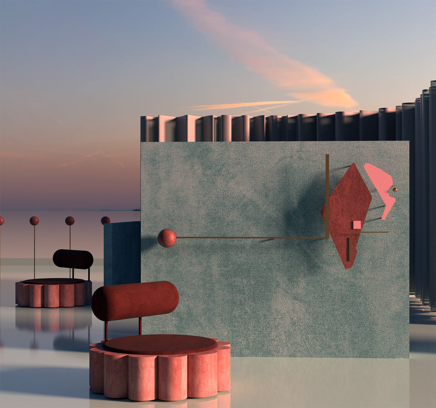
'Constellations I' is the first image in a new series by Visual Citizens which explores the idea of the 'viewing platform.' Each image presents a space on the boundary between architecture and the environment. Places where one can sit and experience the night sky, explain Shali and Adam.
How would you describe your aesthetic and work to others?
AK (Adam Kelly): I would describe our work as being surreal immersive visuals. Digital design allows us to participate in a medium not constrained by the usual architectural restrictions. We are able to fully immerse ourselves in the complete design of space–designing sculptures, murals, unusual spaces, and lighting them in a dramatic or unnatural way. We like to imagine how traditional spaces could be considered differently. For example, what might an airport or hotel or living room look like in the future?
How do your skills complement or contrast one another?
SM: I would say our skills mostly complement each other, but even so we often spend hours debating design. I approach design in a more intuitive way whereas Adam designs with more structure and a controlled logic.
AK: The combination sometimes works out to be a perfect balance of those two opposing attitudes. Shali can often make surprising and sublime compositions and I can adapt and collect these into something with an order to it.
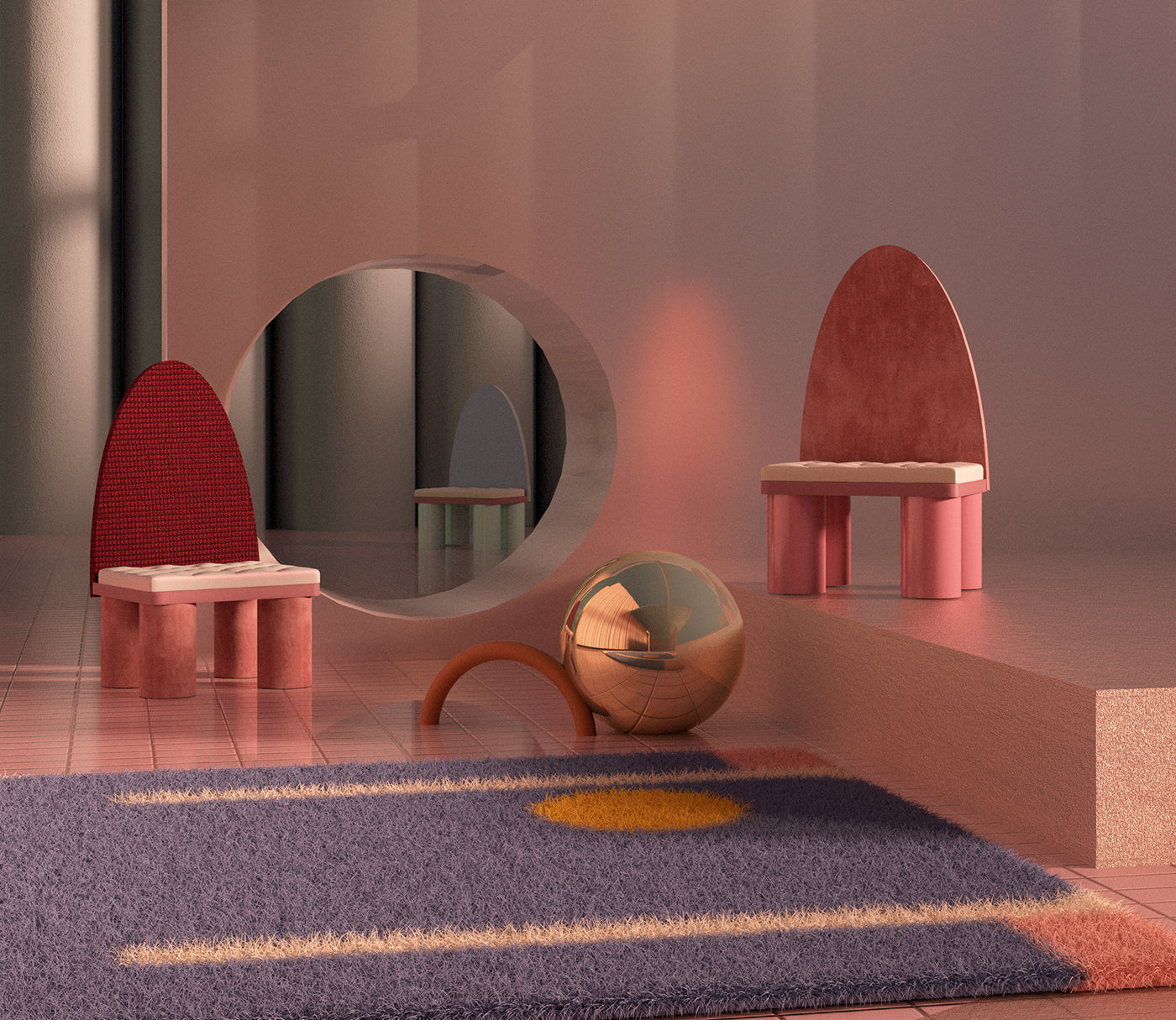
'Blossom Forms,' a creation following a collaboration with Sydney-based designer Evi O, featuring the Sphinx rug she has created with Slowdown Studio.
What’s a normal day like when you run a design studio? Who else is in your team...
SM: Well it is just the two of us at the moment. I normally start the morning with some coffee while listening to The Guardian news podcast, I try to get an early morning yoga session in, then it's often replying to emails for the rest of the morning. After that, I begin with design in our attic office, basically for the rest of the day, sometimes until late at night.
"Visualizations, for us, are an interesting medium for design. They are a kind of escape from the reality of practical design constraints, allowing us to render surreal environments and fill them with fantastical objects"
You made a big announcement at Milan Design Week with a furniture designer. Can you tell us more about this and how the collaboration came about?
SM: It has been really great working with Geke Lensink, she's an established furniture designer in Amsterdam and we have learned a lot from her. She contacted us to do an image for the launch of her new collection entitled “Souvenir,” which was shown at this year's Milan Design Week.
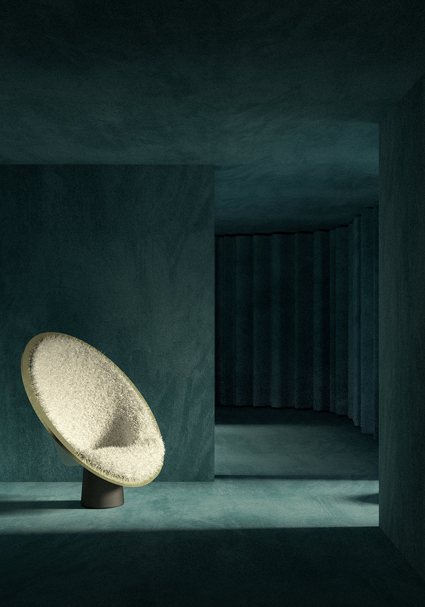
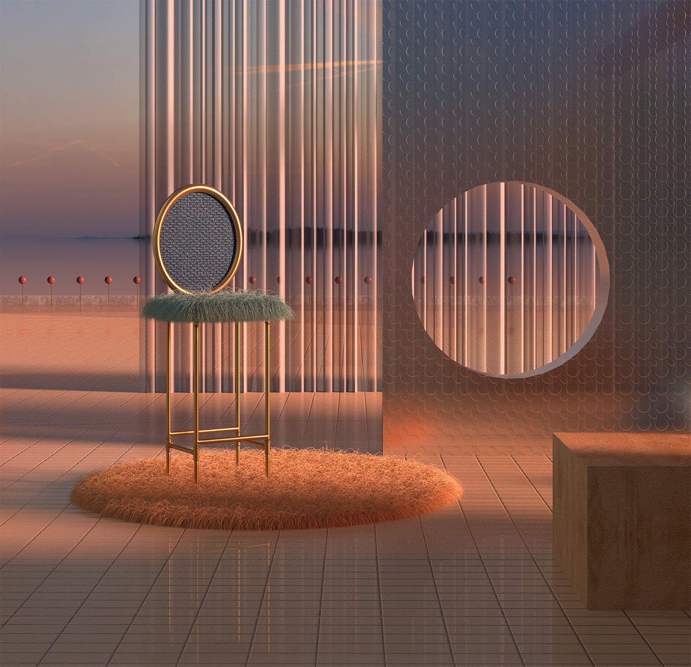
An emerald green-reading space envisioned by Visual Citizens, the color and composition alludes to a sense of being in a utopian future.
You were asked to explore the idea of cultural fluidity through visuals. This doesn’t sound like a straightforward task, what thoughts and planning went into making this a reality?
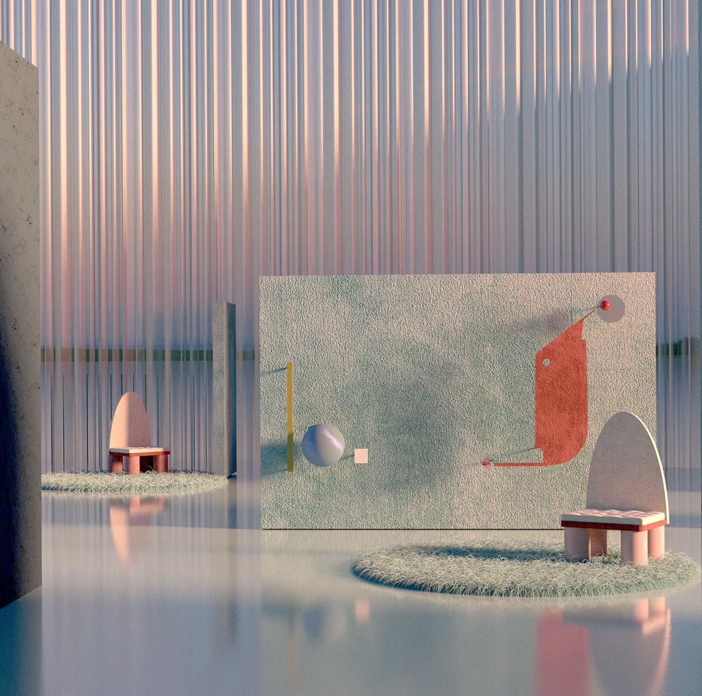
AK: Our understanding from discussions with Geke Lensink was that “Souvenir” is about a recognizable product of a fluid design process. These are pieces of furniture that she has resigned after drawing from memories of her travels throughout the years. The undertone to this work is that society is increasingly fluid–a place of difference and multitudes in which an individual identity can (hopefully) be found or established. Influence by designs from different cultures, each furniture piece is the result of a filtering and abstraction process. Therefore we have situated the objects in an imagined space where fluidity has really taken hold in society. We loosely imagine that this could be some form of space where travelers meet or rest–like a futuristic oasis. This is how we tried to present the years of travel experiences that have been funneled into the design of “Souvenir.” The aesthetic concept of our image is ‘visual ambiguity’ to embody the ideas of 'fluidity' that are contained within “Souvenir.” Mirrors, curtains, and tinted glass are used to present the objects both directly and indirectly, acting as a metaphor for the concept of the series. The colors in the image are a gradient from blue to pink to create further ambiguity in the scene.
"This digital world that is developing around us will need to be designed. We love to imagine what the future will hold for design–perhaps designers will find themselves increasingly involved in creating, curating, and populating digital environments rather than physical ones"
Rendering surreal environments: Is this a fair analysis of what Visual Citizens stand for, or even better, is known for?
SM: Yes, you could say that. Visualizations, for us, are an interesting medium for design. They are a kind of escape from the reality of practical design constraints, allowing us to render surreal environments and fill them with fantastical objects. Of course, we also love to work on other aspects of design, using the ideas and skills we have refined in visualizations within the real world. For example, we are soon to start a project to design and curate a part of the retail space. Our furniture is always intended to be somewhere between a practical, useful object, and an aesthetic element within the scene. This is followed up by designing purely sculptural objects and abstract murals that are the focal points of each space. The spaces are completed with richly toned materials and dramatic, often unnatural, lighting. The digital settings are intended to be intensely stylistic to immerse the viewer within them, to invite them to imagine the sensation of being within our fictitious spaces. We are fascinated by the functions and materialities of the spaces of the future.
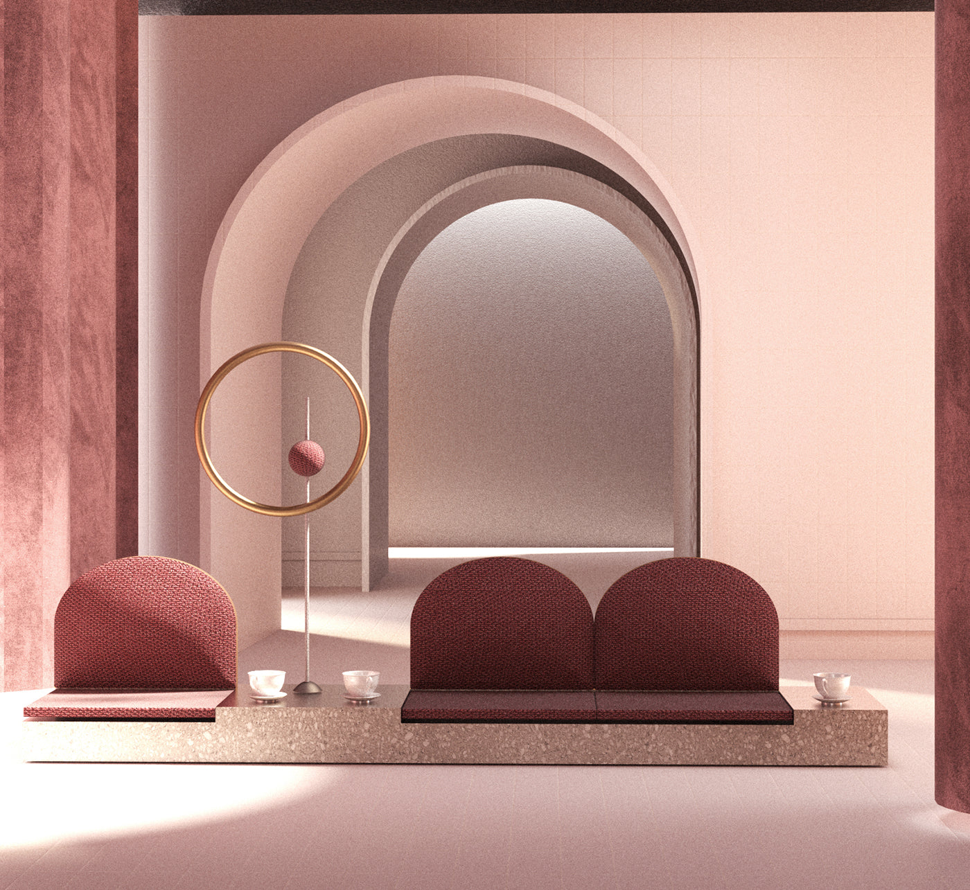
A rendered vision of a calm and soothing waiting room of the future.
You say you’ve been influenced by the work of architecture’s modern masters: who do you consider masters and how does their work influence yours?
AK: Yes one of our favorite sources of inspiration has always been modernist architecture, we love the works of Le Corbusier, Ludwig Mies van der Rohe, Eero Saarinen, Adolf Loos, and Louis Kahn amongst others... However, our work only partially reflects that style of design as we try to translate the lessons we have learned from 'Modernism' to something more playful through an expanded material selection, wider color palette, and whimsical objects.
"Perhaps designers will find themselves increasingly involved in creating, curating, and populating digital environments rather than physical ones. Perhaps this could even be a solution to the vast amounts of waste produced in our 'throwaway' society"
What project have you both been most satisfied with to date?
SM: We recently worked on a project combining photography and rendering. It started off by collaborating with some friends of ours, the creative duo, Ying + Shuxi, and a stylish, Xiaoyi Qin. They suggested we combine their photography with our renders. This was particularly exciting as we could imagine our spaces really come to life with us in it. It was interesting for us all to push the boundaries between our different disciplines.
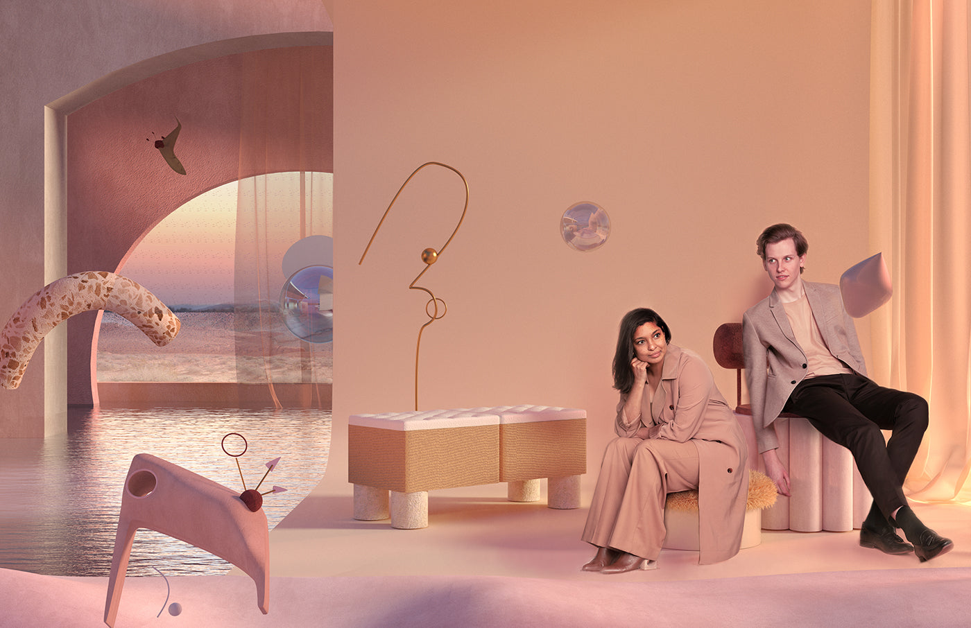
A Rotterdam-based collaboration between Visual Citizens, featuring photography by Ying + Shuxi, and styling by Xiaoyi Qin.
To end the interview, is there anything you’d like to share that is exciting you about the design world or world in general...
AK and SM: We feel that the design world is in an incredible position. Digital media are increasingly important (and immersive) than ever before, and this digital world that is developing around us will need to be designed. We love to imagine what the future will hold for design–perhaps designers will find themselves increasingly involved in creating, curating, and populating digital environments rather than physical ones. Perhaps this could even be a solution to the vast amounts of waste produced in our 'throwaway' society.
Explore Visual Citizens through Dreamscapes & Artificial Architecture


