The Infographic Is Mightier Than The Sword
A pioneer featured in Visual Journalism, Alberto Lucas López uses the language of infographics in a uniquely powerful and digestible way
For many people at National Geographic, Alberto Lucas López will always be the man with three names. He is the first person to have broken out of the strict publishing style guide and to add his second surname to his byline, in honor of his mother, with no objections from anyone.
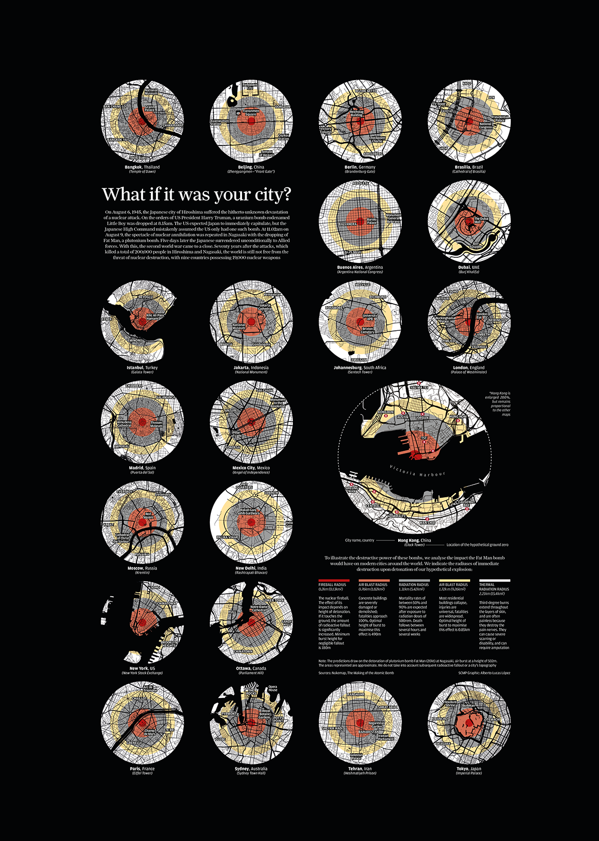
Seventy years after the United States dropped atomic bombs on the Japanese cities of Hiroshima and Nagasaki, the author visualized the devastating effects that these attacks would have on cities around the world. The piece highlights the risks of the increasing number of nuclear powers and of the 19,000 nuclear warheads then in existence. (What If It Was Your City?, South China Morning Post)
Lucas López has never been afraid of taking risks. After an intense period of work in Hong Kong, he accepted the offer to become a senior graphics editor at National Geographic. Pursuing the path of illustrated infographics made popular by Javier Zarracina and Fernando G. Baptista, he now has his own distinctive style and constantly pushes the boundaries of creativity within journalism.
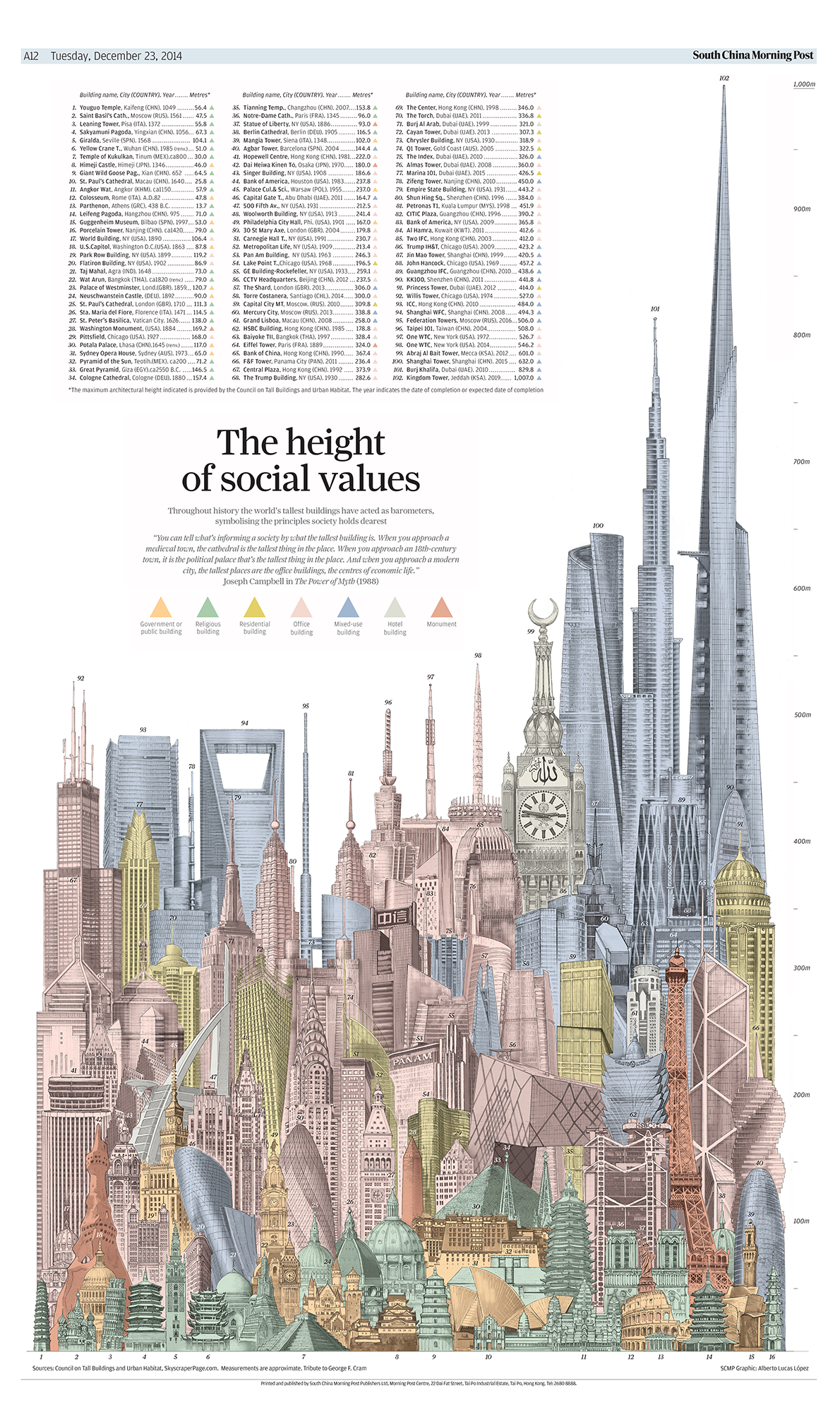
John Emslie’s 1850 piece “Principle Buildings in the World” provided Alberto Lucas López with the inspiration for this graphic in which he grouped together 102 buildings from 25 countries, indicating the locations, dates of construction. (The Height of Social Values, South China Morning Post)
Lucas López is already one of the world’s most unique talents in infographics. Before the National Geographic, he has worked as at the Spanish daily newspaper El Correo as an iconographer, was the graphics director at the South China Morning Post of Hong Kong, and currently holds the post of senior graphics editor at National Geographic. And he’s only been at it for a decade.
"Visual culture is the lodestone of design. The characters used in writing are the genesis of that culture"
In 2008, towards the end of his studies in journalism at the University of Navarra, he had decided, almost by chance, to take an elective in infographics, which was offered on Saturdays: “The only available spot in my calendar,” he recalls. It was like Cupid’s arrow. In the first class, the basic concepts of the subject took him by surprise; in the second, he realized that infographics “is journalism in capital letters;” by the third class, he was hooked and had no doubt: “Infographics is the pearl of journalism.” Although his meteoric career has not gone to his head. “Each day I try to go to bed having learned something,” he says. He names Charles J. Minard, Fritz Kahn, and Fortunato Depero as his influences, but Lucas López has broken out and made a name for himself. On top of that, he has earned prestige at a foreign newspaper where he learned the importance of respecting cultural differences. “I set out to learn and to understand the local culture as soon as I got to Hong Kong. It was the only way that I would be able to offer anything of interest to our local readers,” he recalls.
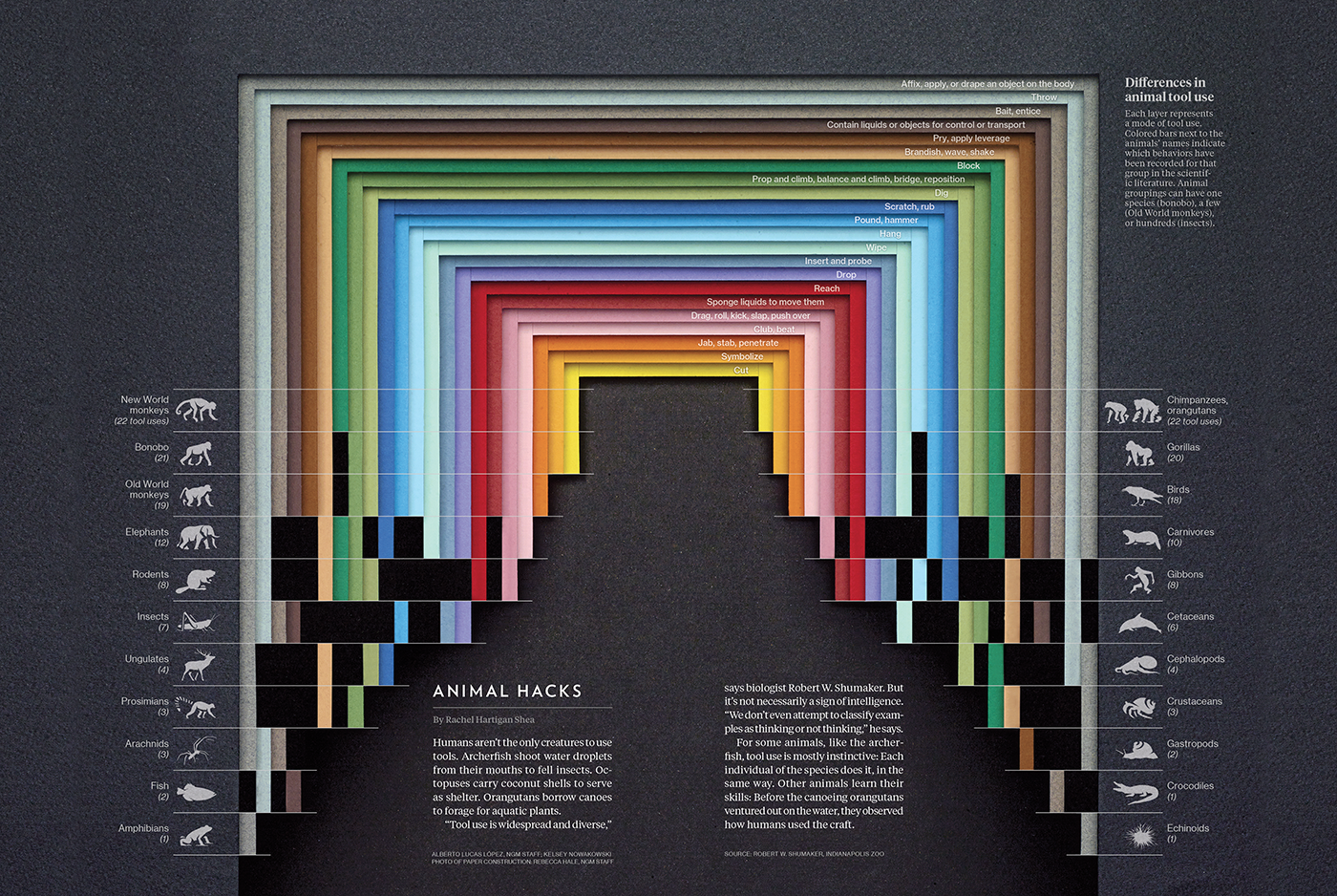
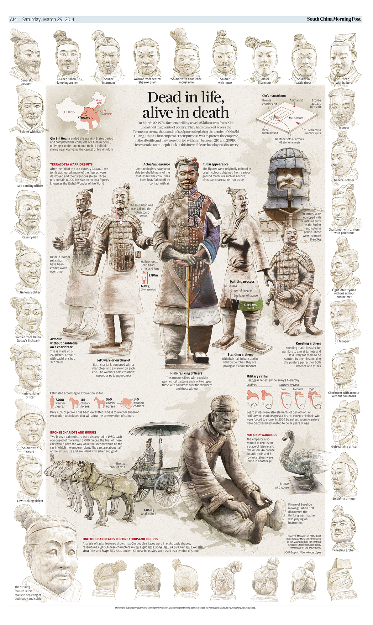 This graphic from 2014 includes hand-drawn sketches of the Terracotta Warriors of Xian that show the faces and rank of several of the statues. These portraits then act as a frame for the main graphic, which includes many details on the uniforms of the soldiers. (Dead in Life, Alive in Death, South China Morning Post)
 This graphic from 2014 includes hand-drawn sketches of the Terracotta Warriors of Xian that show the faces and rank of several of the statues. These portraits then act as a frame for the main graphic, which includes many details on the uniforms of the soldiers. (Dead in Life, Alive in Death, South China Morning Post)
This immersion allowed him to go rapidly from being an expat to a citizen—and now he misses Asia. “Visual culture is the lodestone of design. The characters used in writing are the genesis of that culture,” he says. “It had never occurred to me, but when I arrived in Hong Kong I could clearly see the parallels between the system of writing and the visual preferences of the Asian public.” The compression of information into very tiny spaces—the chaos and the lack of hierarchy—confused him. “The worst of it was to realize that many times we make the mistake of thinking that anything outside of our visual culture is incorrect,” he explains.
Over four years, Lucas López worked intermittently for El Correo, where he took in the lively legacy of the legendary school of illustrated infographics of Javier Zarracina and Fernando G. Baptista, which now continues under its editor, Josemi Benítez. He won several medals at the Malofiej, but he wanted to achieve more. He kept on learning. He wanted to get into the digital universe, so he enrolled in a Master’s program in motion graphics offered in Madrid. In the midst of this came the offer from Hong Kong. It was his first overseas adventure, but he didn’t hesitate for a moment.

Alberto Lucas López joined National Geographic as Senior Graphics Editor in 2016. His individual work has been renowned with more than 100 SND, Malofiej, WAN-IFRA, European Newspaper Awards, DJA Global Editors Network, Kantar Information Is Beautiful Awards, SOPA, and Laus Awards, among others.
In 2013, Lucas López moved to the other side of the world to work for the South China Morning Post, a newspaper where the British graphics editor Simon Scarr had worked and where another Spaniard, Adolfo Arranz, was an editor. “I had the good luck of coming to work at a newspaper that had no fear of risk. Its pages featured large, figurative graphics but also complex visualizations,” he recalls. “For a time, I got away from breaking news a bit and visually presented another kind of subject matter that was current but less urgent.” While there, he had to do almost everything: investigation, reporting, data analysis, sketching, illustration, and so forth. He published an average of 40 full-page features a year.
"I went from publishing for 150,000 readers to 15 million readers. There are more filters to go through"
The Navarran thus captured the attention of many media companies and professionals from other countries. For example, his graphic, “A World of Languages”—a sort of abstract linguistic map of the world similar to the ones Amanda Cox does for the New York Times—has been seen and shared by more than 20 million people around the world. In the following week, he sketched out the one hundred most important buildings in history, applying the theory that Joseph Campbell developed in the book The Power of Myth. The original illustration, produced entirely in ink, was two meters tall so that not a single detail of the piece was missed.
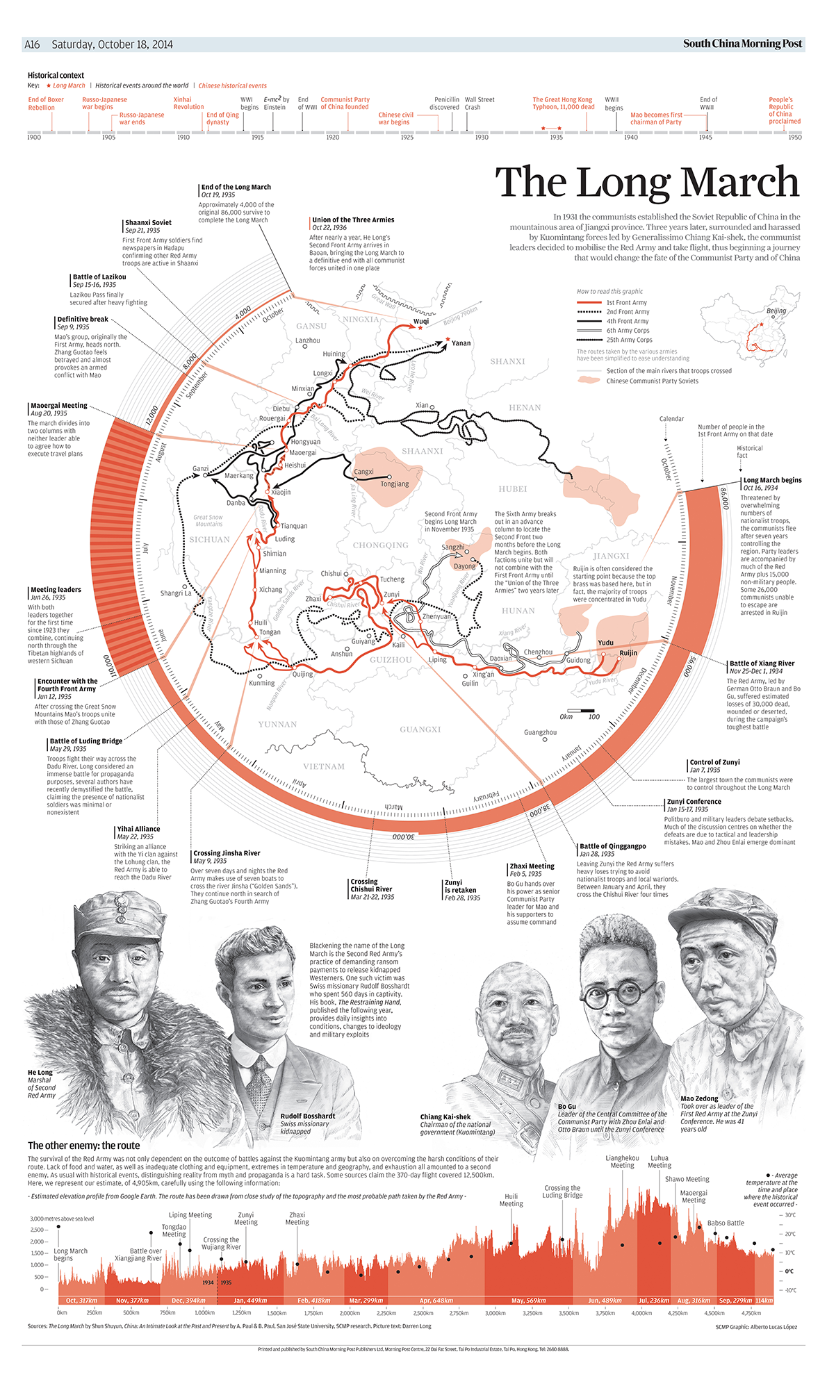 Lucas examines the arduous journey made by the Chinese Red Army through the interior of the country as they fled the Army of the Republic of China. The march finished with the Communist Party and its leader, Mao Tse Tung, seizing power. Lucas shows how the numbers of Communist troops increased and decreased over time and by location, and highlights the most important events that occurred during the Long March. (The Long March, South China Morning Post)
 Lucas examines the arduous journey made by the Chinese Red Army through the interior of the country as they fled the Army of the Republic of China. The march finished with the Communist Party and its leader, Mao Tse Tung, seizing power. Lucas shows how the numbers of Communist troops increased and decreased over time and by location, and highlights the most important events that occurred during the Long March. (The Long March, South China Morning Post)
With his ability to absorb and integrate all sorts of influences and narratives—both in data visualizations and classic illustrations—Lucas López quickly felt at home in the fast-paced Hong Kong environment. It was very hard for him to leave it behind. But when the call came from National Geographic, the temptation was too strong for his impetuous career-driven mindset. Honored, and a bit overwhelmed, he said yes. He was surprised to find out that National Geographic also had a highly demanding, frenetic pace. “I went from publishing for 150,000 readers to 15 million readers. There are more filters to go through,” he says. “Now I feel more uneasy about meeting deadlines than I did when I barely had any time at all.”
Today, in Washington, Lucas works as a multiplatform iconographer. He recently decided to create the magazine’s first infographic using Kraft paper. He is disappointed by the way many media outlets will only offer the service their readers expect or are comfortable with. “For me, that is the quickest shortcut to failure,” he explains. “If we are not willing to create content beyond what is conventional, we will end up killing journalism. Creativity is a journey of suffering, of infinite frustrations, of insecure joy. It is an addictive and probably destructive journey. But we should never be afraid of taking risks!
Infographics can tell the most compelling stories in the most condensed manner, learn more through Visual Journalism.
